To rescue Kahlo from the clutches of the corporate art market, we need to acknowledge the overt and covert political dimensions of the work, demands GAVIN O’TOOLE

Johnston spells London
MICHAL BONCZA reports on an exhibition on the typeface created a century ago for the capital’s
Underground which has come to represent not just transport but the image of the city itself
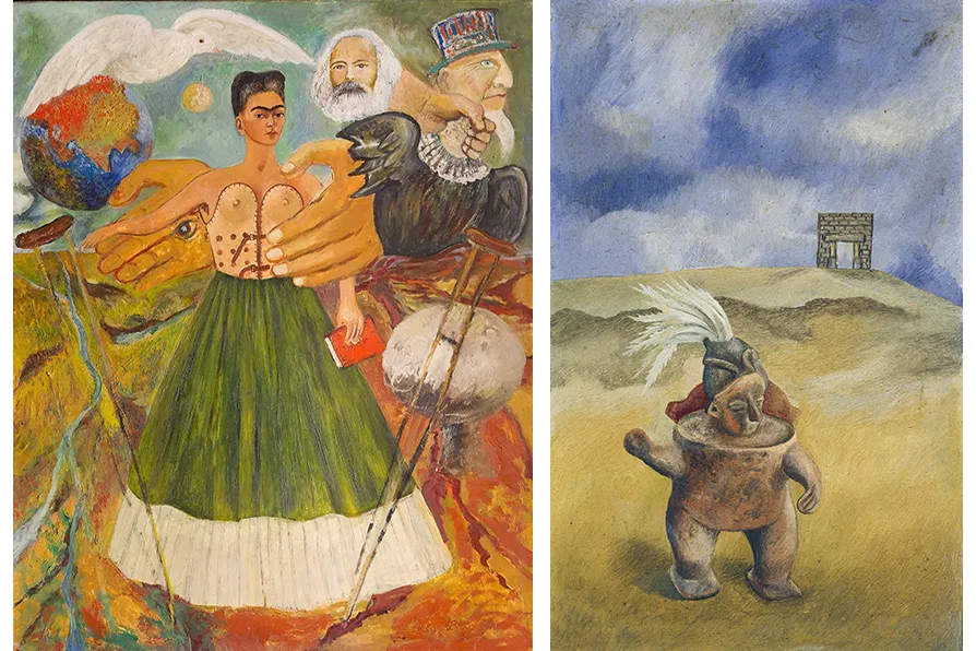
If you can see past the relentless commodification you will be rewarded by enormously powerful work, suggests JENNY MITCHELL
CHRIS SEARLE revels in the one-off collaboration between an American polymath and a British Muslim, and detects the presence of their revolutionary forebear
GORDON PARSONS revels in an ebullient production of Shakespeare’s magical comedy
BRENT CUTLER welcomes a thoughtful analysis of the Erdogan regime, viewed through the evolving history of a neighbourhood in Istanbul
GORDON PARSONS regrets the price, but is dazzled by an outstandingly ambitious study of the way art restoration in particular, and culture in general was weaponised by the Nazis


HARRY BECK’S London Tube map of 1931 is recognised globally as a graphic icon. Yet few recognise the name of the creator of its equally memorable typeface, the Uruguay-born calligrapher Edward Johnston.
This year marks the centenary of the inauguration of the Johnston typeface, used not only on the map but for all the Tube’s public information signage. Modernist, lucid and emanating serenity in the visual noise of an increasingly complex world, it’s designed to never be confused with advertising and has established one of the most durable corporate typographic identities to be found anywhere.
Johnston’s brief was to create a lettering system for London Underground that would have the “the bold simplicity of the authentic lettering of the finest periods” and belong “unmistakably to the 20th century.”
Similar stories
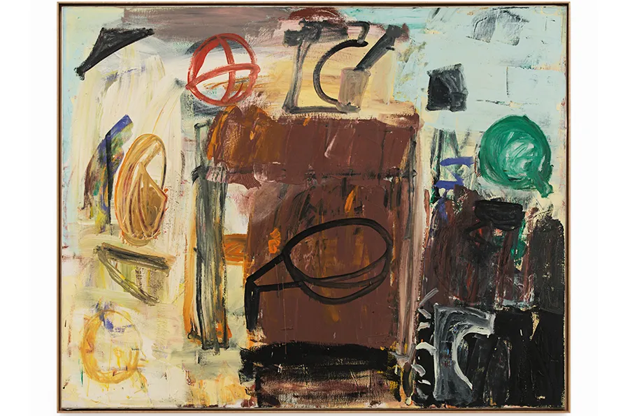
MIRANDA RICHMOND relishes the gloriously liberated art of Roy Oxlade, and traces his method back to the thinking of David Bomberg, his acknowledged teacher
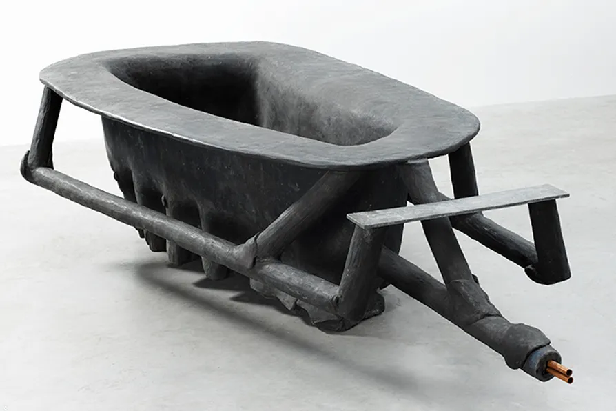
JAN WOOLF ponders the works and contested reputation of the West German sculptor and provocateur, who believed that everybody is potentially an artist
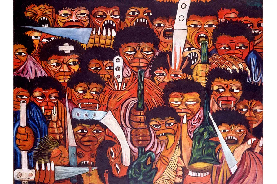
JOHN GREEN welcomes a remarkable study of Mozambique’s most renowned contemporary artist